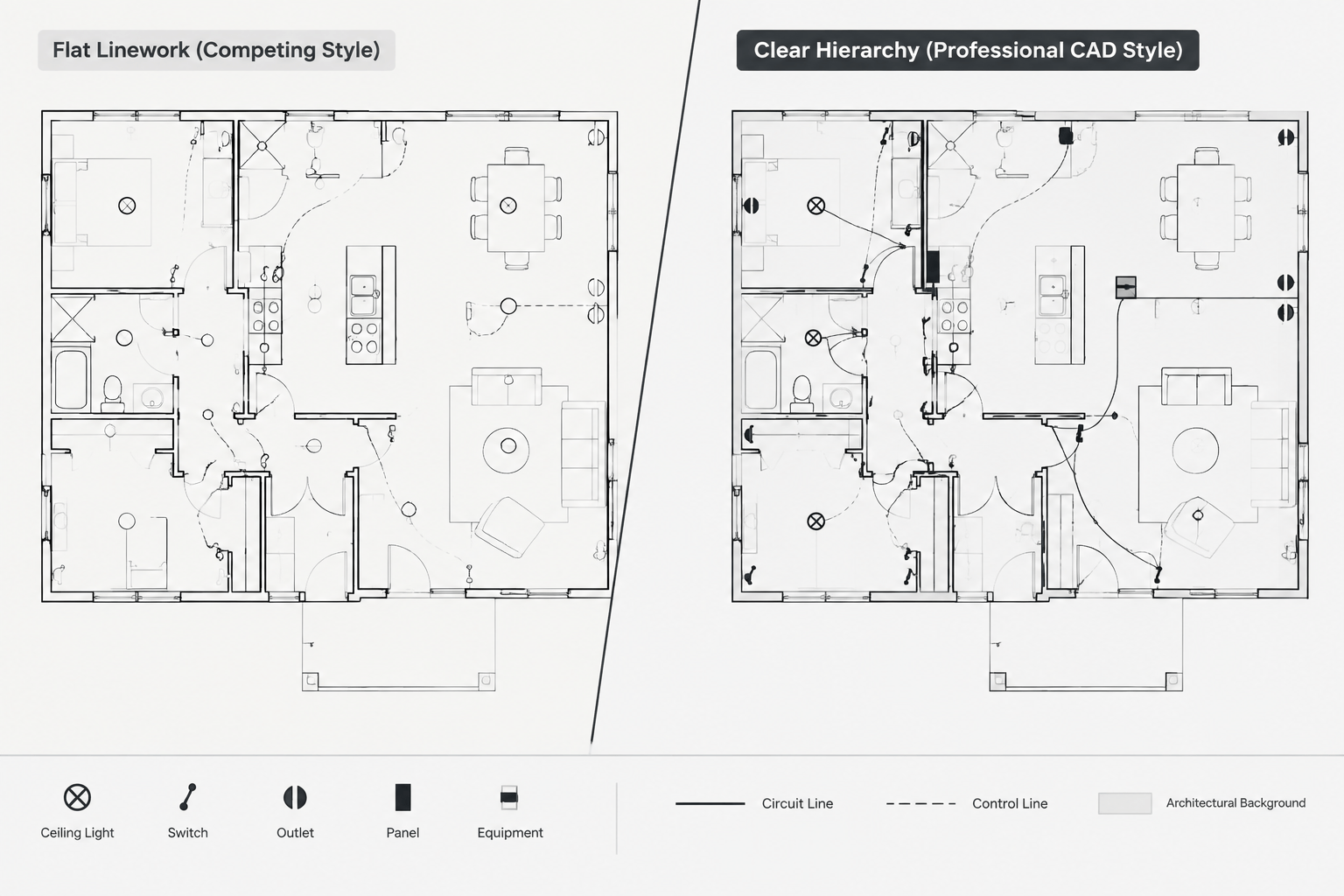
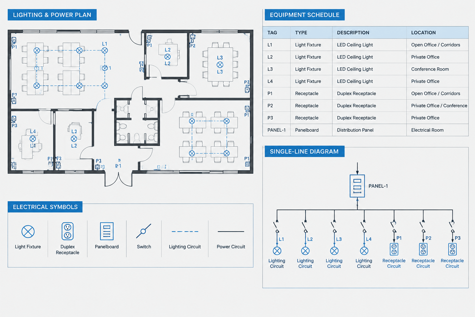
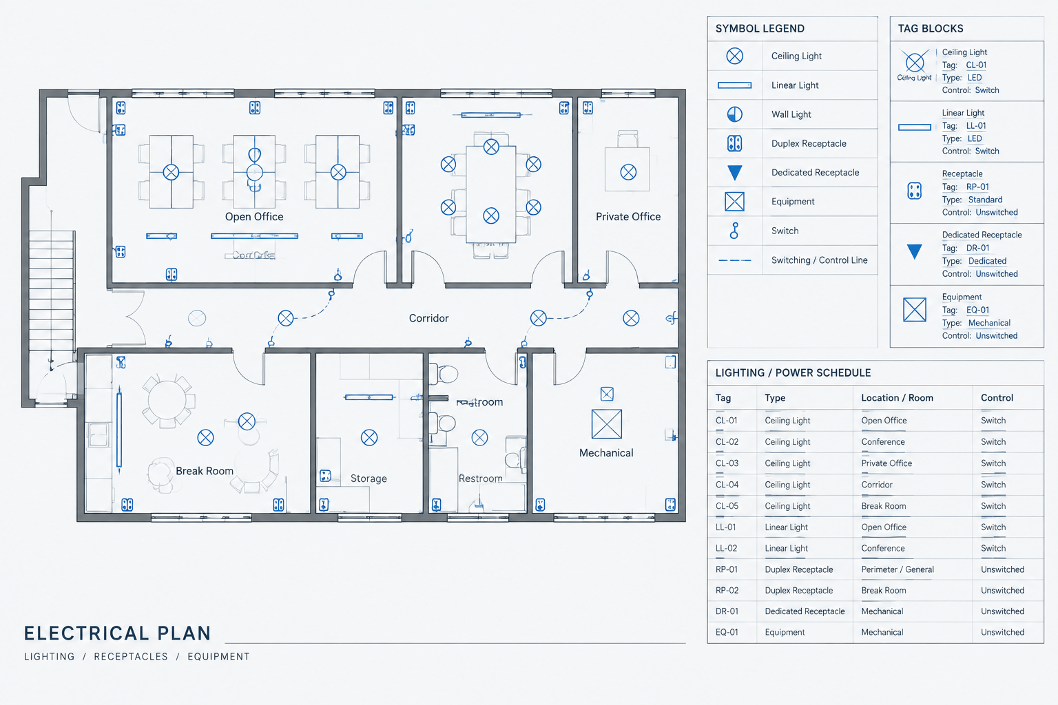
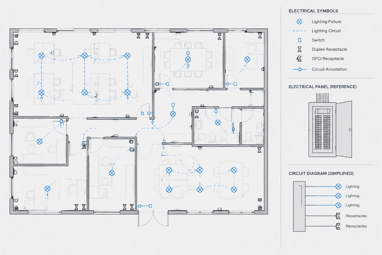
An electrical plan can contain accurate symbols, circuiting, notes, and equipment locations yet still be difficult to read. The problem is often not the electrical information itself, but the graphic hierarchy used to present it. If every object plots with similar darkness and thickness, architectural backgrounds compete with electrical devices, circuit lines merge with walls, and important equipment becomes hard to identify.
A coordinated system of electrical CAD lineweights, linetypes, screening, and plot styles helps readers understand what matters first. The goal is not to make a drawing visually elaborate. It is to separate primary electrical content from supporting information while keeping the complete sheet usable in printed and digital formats.
What Graphic Hierarchy Means on an Electrical Drawing
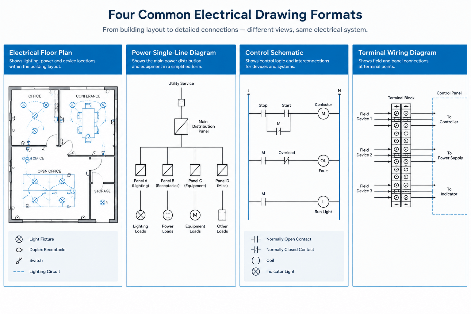
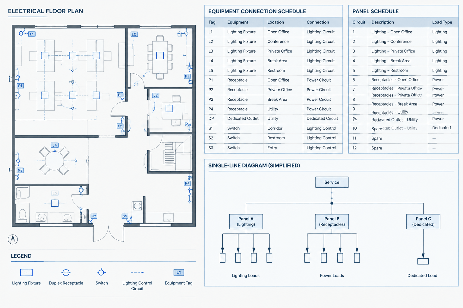
Graphic hierarchy is the visual order that tells the reader which information is primary, secondary, or contextual. On an electrical floor plan, the electrical design should generally read more strongly than the architectural background. Within the electrical work, major equipment, devices, circuit paths, annotations, and secondary references may each need a different visual emphasis.
This hierarchy can be created with several coordinated properties:
- Lineweight: The plotted thickness of an object or layer.
- Linetype: A continuous, dashed, center, hidden, or other repeating line pattern.
- Screening: A lighter plotted appearance used for background or secondary content.
- Color: A useful on-screen organizational tool that may also control plotting, depending on the office workflow.
- Draw order: The stacking relationship between fills, linework, symbols, text, and referenced backgrounds.
- Symbol fill: Solid or patterned areas that help selected symbols remain visible against dense backgrounds.
No single property should carry the entire hierarchy. For example, changing every secondary object to a dashed linetype will not solve a crowded plan. A better result usually comes from combining restrained lineweights with screening and disciplined layer management.
A Practical Lineweight Hierarchy
A drafting team does not need a large number of plotted thicknesses to create a readable electrical sheet. A compact hierarchy is easier to maintain and more likely to produce consistent results across drawings.
| Graphic role | Typical electrical content | Intended appearance |
|---|---|---|
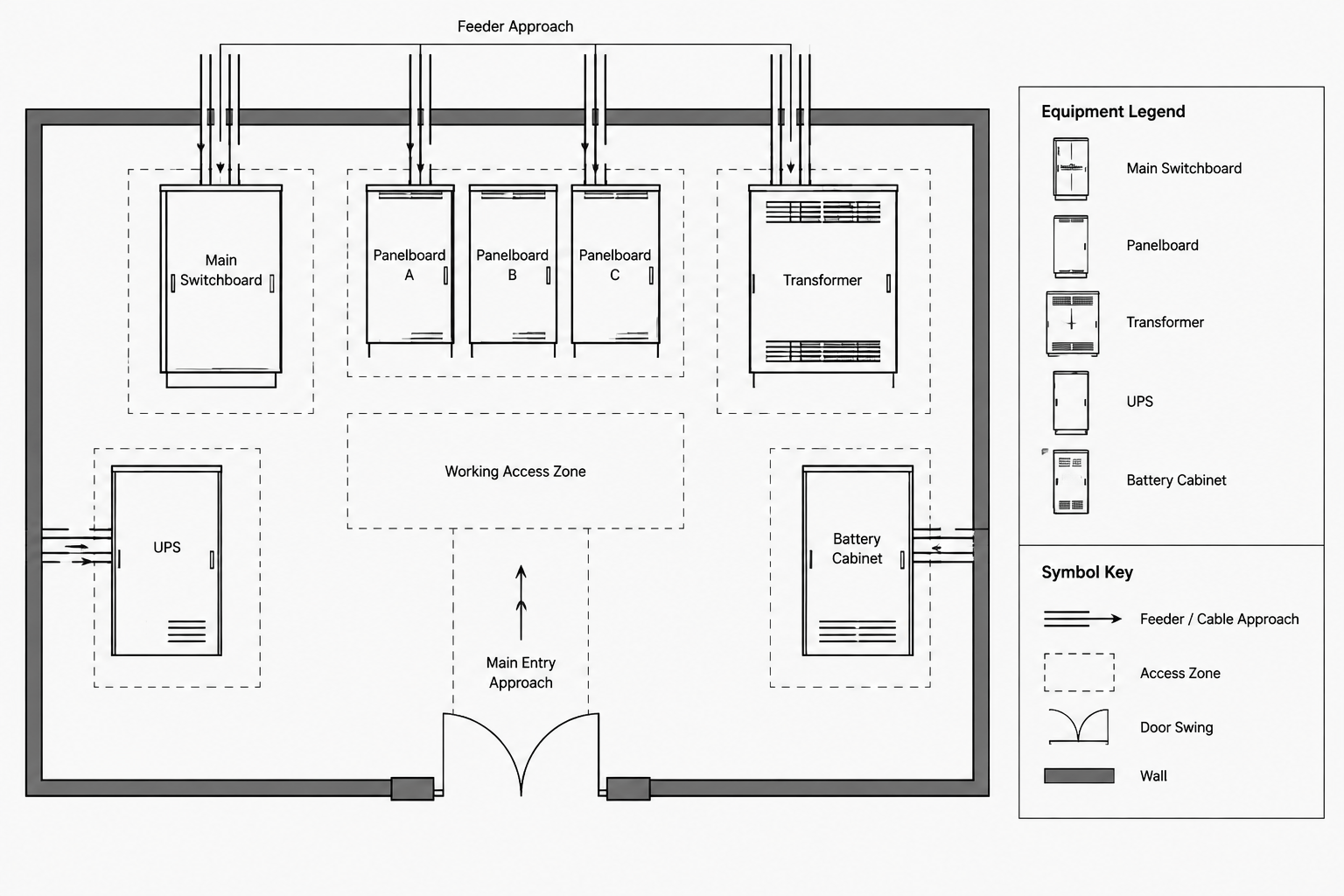
| Primary emphasis | Major equipment outlines, distribution equipment, selected boundaries, and important diagram buses | Strong enough to anchor the drawing without overpowering labels |
| Normal electrical work | Devices, luminaires, circuit lines, conduit routes, cable tray, and typical symbols | Clear and dominant over the background |
| Secondary electrical information | Control relationships, optional references, existing work, or supplemental diagram connections | Visible but subordinate to new or primary work |
| Annotations | Text, tags, leaders, dimensions, and reference markers | Crisp and legible without appearing heavier than equipment |
| Background context | Walls, doors, furniture, ceilings, structural grids, and other referenced disciplines | Light enough to provide orientation without competing with electrical content |
The exact plotted settings should follow the project or office CAD standard. A downloaded symbol library may use different colors, layers, or object-level lineweights, so imported content should be normalized before it becomes part of a production drawing.
Use Linetypes to Communicate Meaning
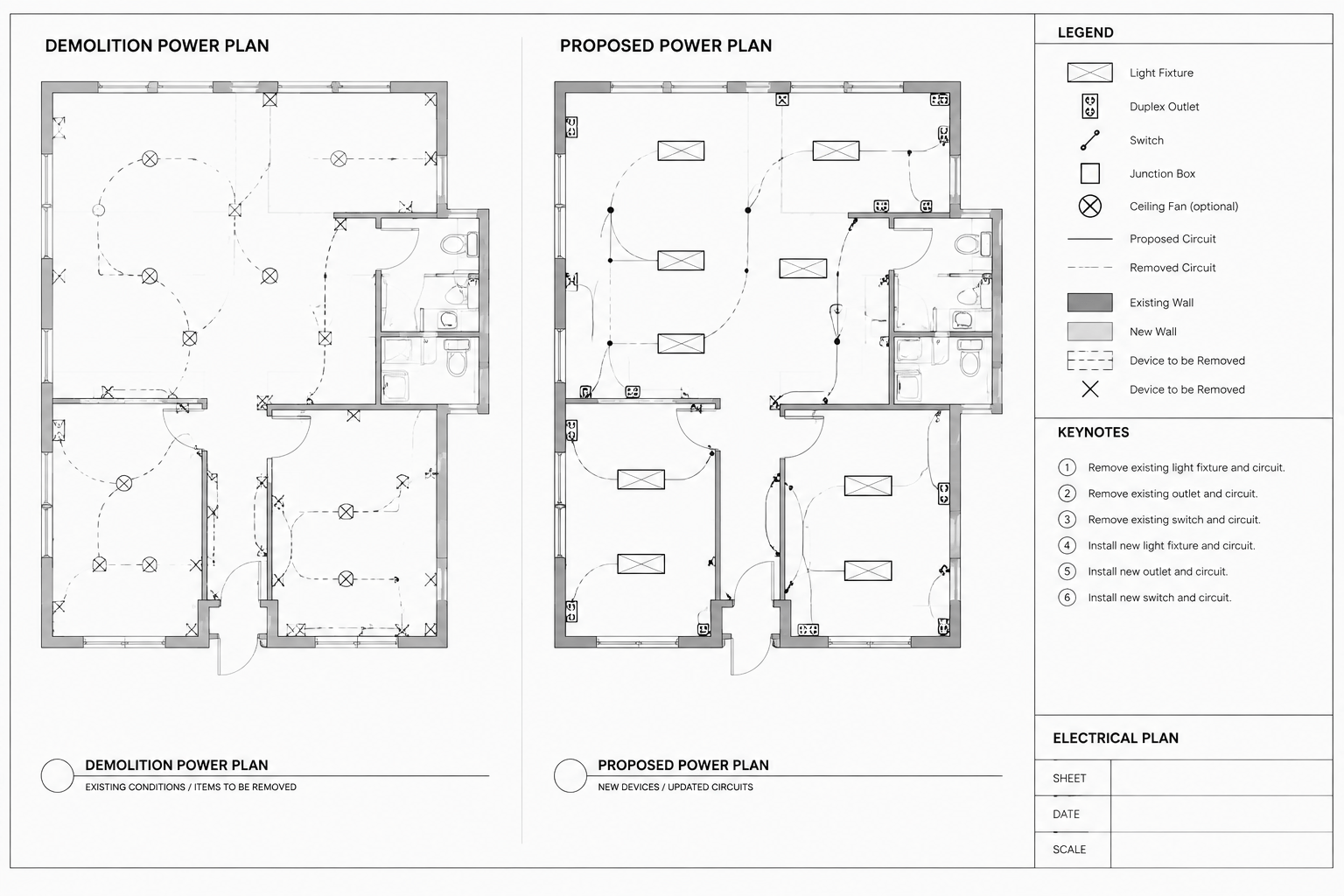
Linetypes should indicate a documented difference, not merely add visual variety. A dashed line might represent concealed work, an overhead route, a control relationship, an existing condition, or a removal condition. Because the same pattern can mean different things on different projects, its meaning must be defined in the drawing legend or notes.
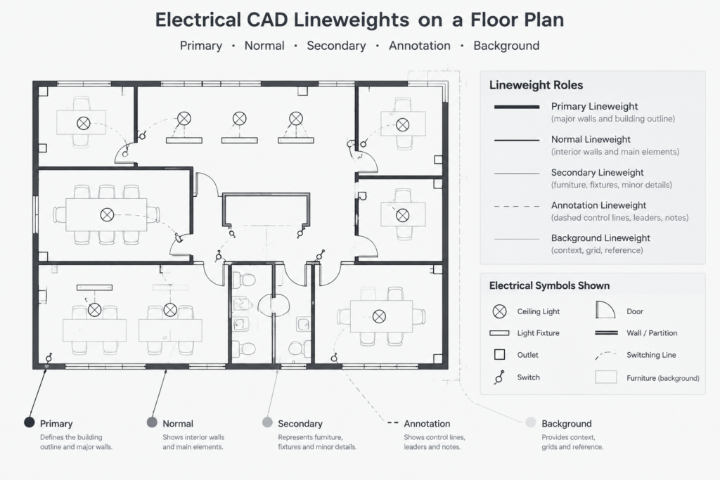
Use these principles when assigning linetypes:
- Apply each linetype consistently across plans, details, and diagrams.
- Do not rely on a dashed pattern alone when two categories must remain distinguishable in a reduced PDF.
- Check that dash spacing remains recognizable at the plotted scale.
- Avoid using an architectural background linetype to communicate an electrical status.
- Keep circuiting and routing lines visually distinct from wall, grid, and ceiling patterns.
Linetype scale deserves particular attention. A pattern that looks correct while editing the model may appear continuous, fragmented, or overly busy through a sheet viewport. Review it in the actual sheet context rather than judging it only from model-space magnification.
Screen Architectural and Consultant Backgrounds Carefully
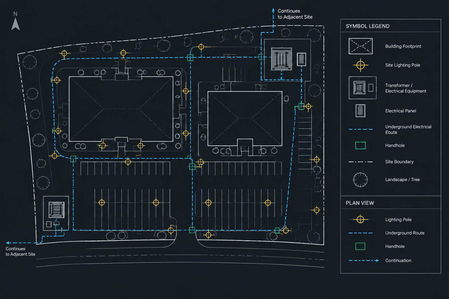
Electrical plans need architectural context. Rooms, walls, doors, casework, ceiling features, and equipment from other disciplines help users locate the electrical work. That context should remain readable, but it should not look like electrical scope.
Screening or muted plotting can push a referenced background behind the active electrical design. This treatment should be evaluated carefully because excessive screening can make room names, door swings, and key coordination features disappear. Insufficient screening can make electrical symbols difficult to find.
Do not edit another discipline’s referenced file solely to create the electrical plot appearance unless the project workflow specifically requires it. Where possible, manage display through reference settings, layer controls, or the established plotting system. This helps preserve coordination and reduces the risk of maintaining an altered duplicate background.
Separate Display Properties from Design Meaning
CAD colors can be useful for identifying systems while drafting, but screen color is not always the same as plotted color. A bright object on a dark editing background may become black, gray, or otherwise transformed by the plot configuration. Conversely, a color that is easily distinguished on screen may be difficult to separate in a grayscale print.
Before assigning meaning to color, determine how the project will be delivered. If users may print a PDF in monochrome, critical distinctions should also be communicated through lineweight, linetype, labels, symbols, or notes. Color should support the documentation, not become its only explanation.
Control Object Overrides Inside CAD Blocks
Electrical CAD blocks often arrive from different sources. Some objects may inherit properties from their insertion layer, while others contain fixed colors, linetypes, fills, or lineweights. This inconsistency can produce a symbol that looks correct in one file but plots incorrectly in another.
When reviewing a block for production use, check:
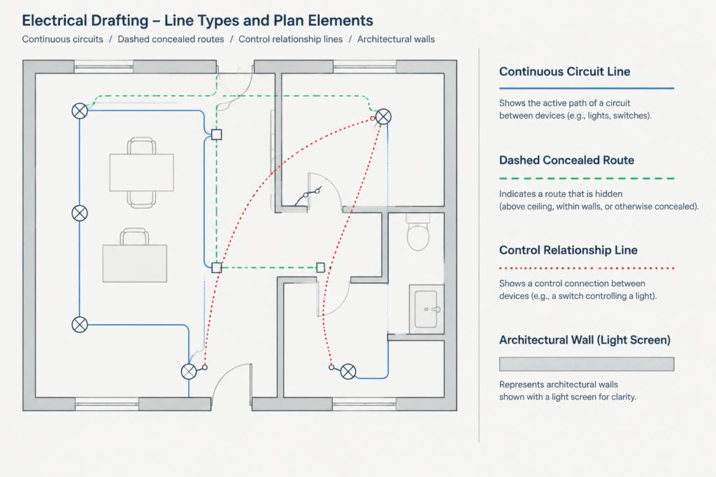
- Whether its components inherit intended layer properties.
- Whether text and attributes remain readable at the planned sheet scale.
- Whether solid fills hide circuit lines or background information.
- Whether nested objects introduce unexpected layers.
- Whether wipeouts, masks, or draw-order settings obscure nearby content.
- Whether the symbol remains recognizable in monochrome output.
Do not assume a downloaded block is project-ready because it looks correct in a preview. Test it with the project’s plotting configuration and compare it with the approved symbol legend. Suitability for a real project must be verified by the responsible design and documentation team.
Coordinate Plot Styles, Layers, and Viewports
A stable plotting workflow depends on coordination between object properties and sheet presentation. Layers organize content, plot styles translate properties into output, and viewports determine how model information appears on a particular sheet. If these parts are developed independently, unexpected results are likely.
Start with layer function
Group objects by meaningful drafting function, such as lighting devices, power devices, circuiting, equipment, annotations, existing work, or removal work. Avoid placing unrelated objects together simply because they should plot with the same thickness. Functional layers make later visibility and coordination changes easier.
Define the plotted role
Decide whether each layer is primary, normal, secondary, annotation, or background content. Map that role to the office plot system rather than assigning properties independently in every file.
Review sheet-specific display
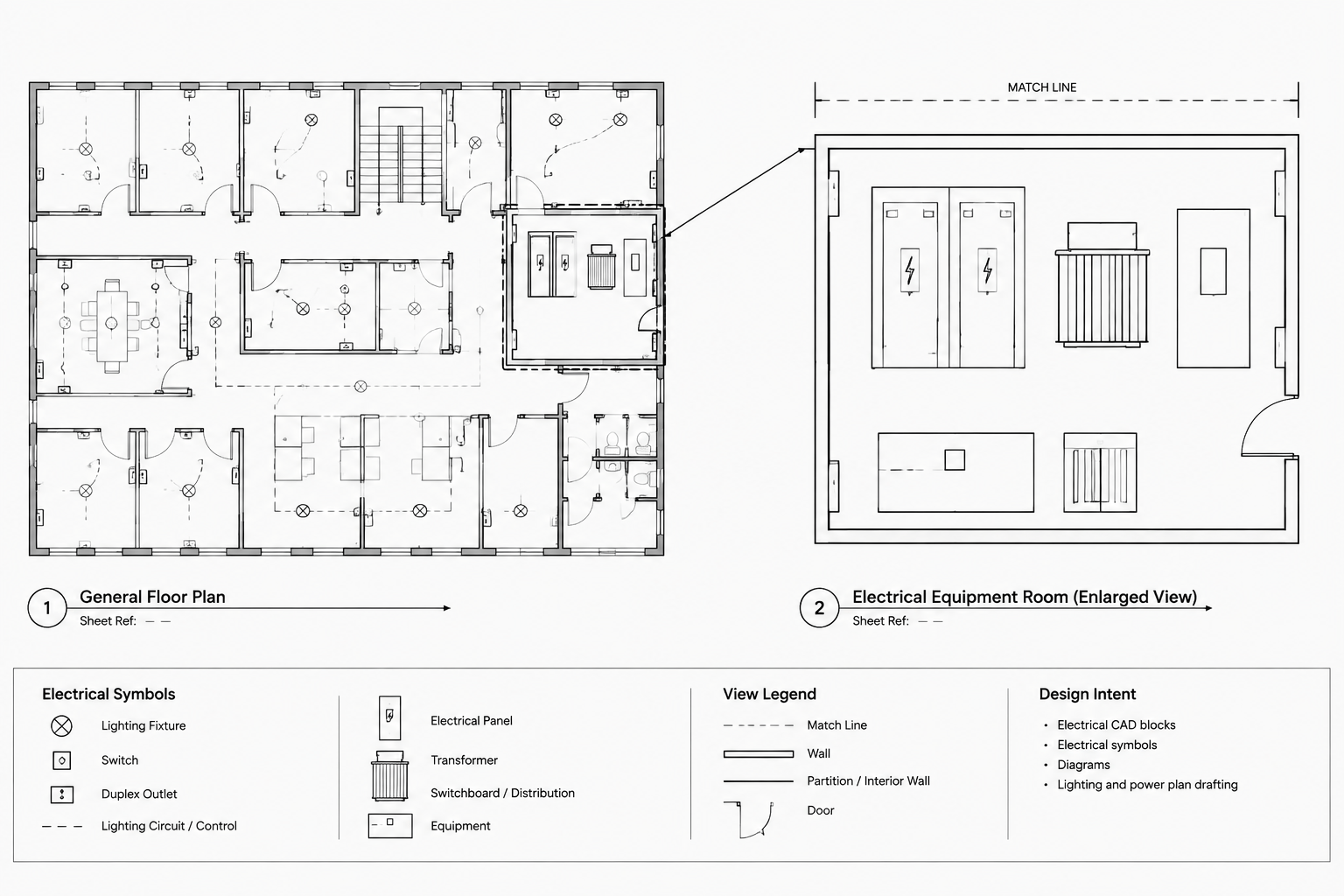
An enlarged plan may need different background visibility than an overall plan. A diagram may use heavier buses and lighter branch connections, while a floor plan may emphasize device symbols and circuiting. Viewport-specific control can be useful, but excessive overrides make sheets harder to troubleshoot. Document intentional exceptions.
Test the Drawing as a Deliverable
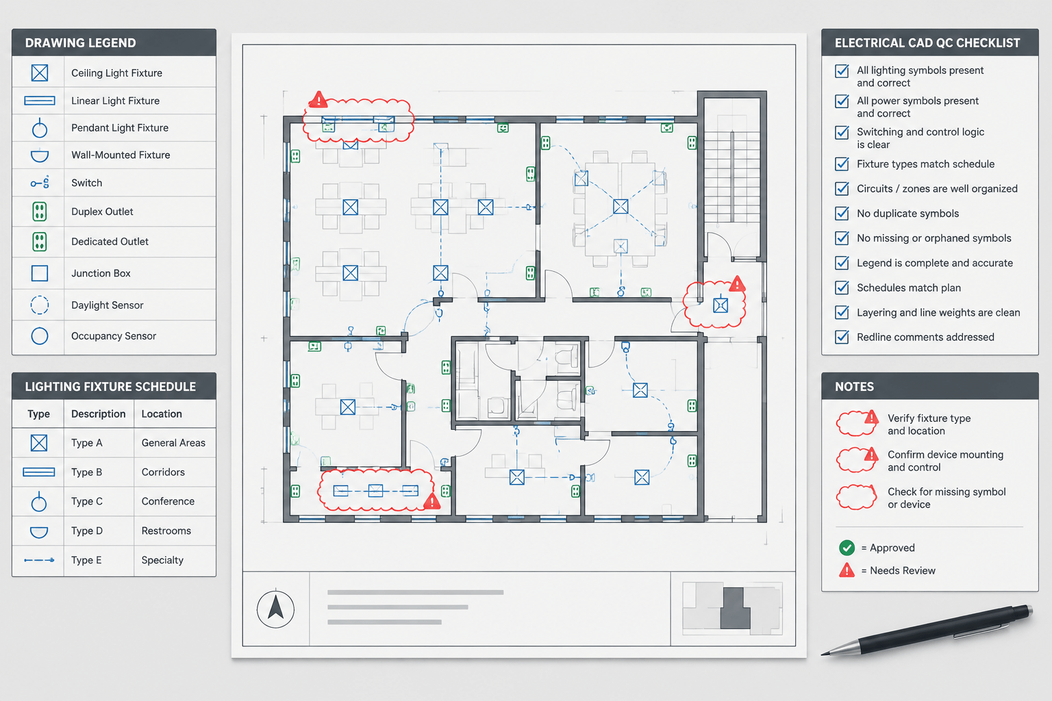
Editing-screen appearance is not a reliable substitute for output testing. Review a generated PDF and, when appropriate, a representative print. Inspect both the full sheet and crowded areas.
A useful plot review should answer the following questions:
- Can electrical devices be found quickly against the background?
- Are text, tags, and leaders crisp at normal viewing size?
- Do dashed lines retain their intended pattern?
- Are existing, new, and removal conditions visibly distinct where used?
- Do fills or masks hide circuiting, room information, or other symbols?
- Does the sheet remain understandable in grayscale?
- Are line crossings clear, especially in dense routing or diagram areas?
- Do match lines, continuation markers, and detail references remain visible?
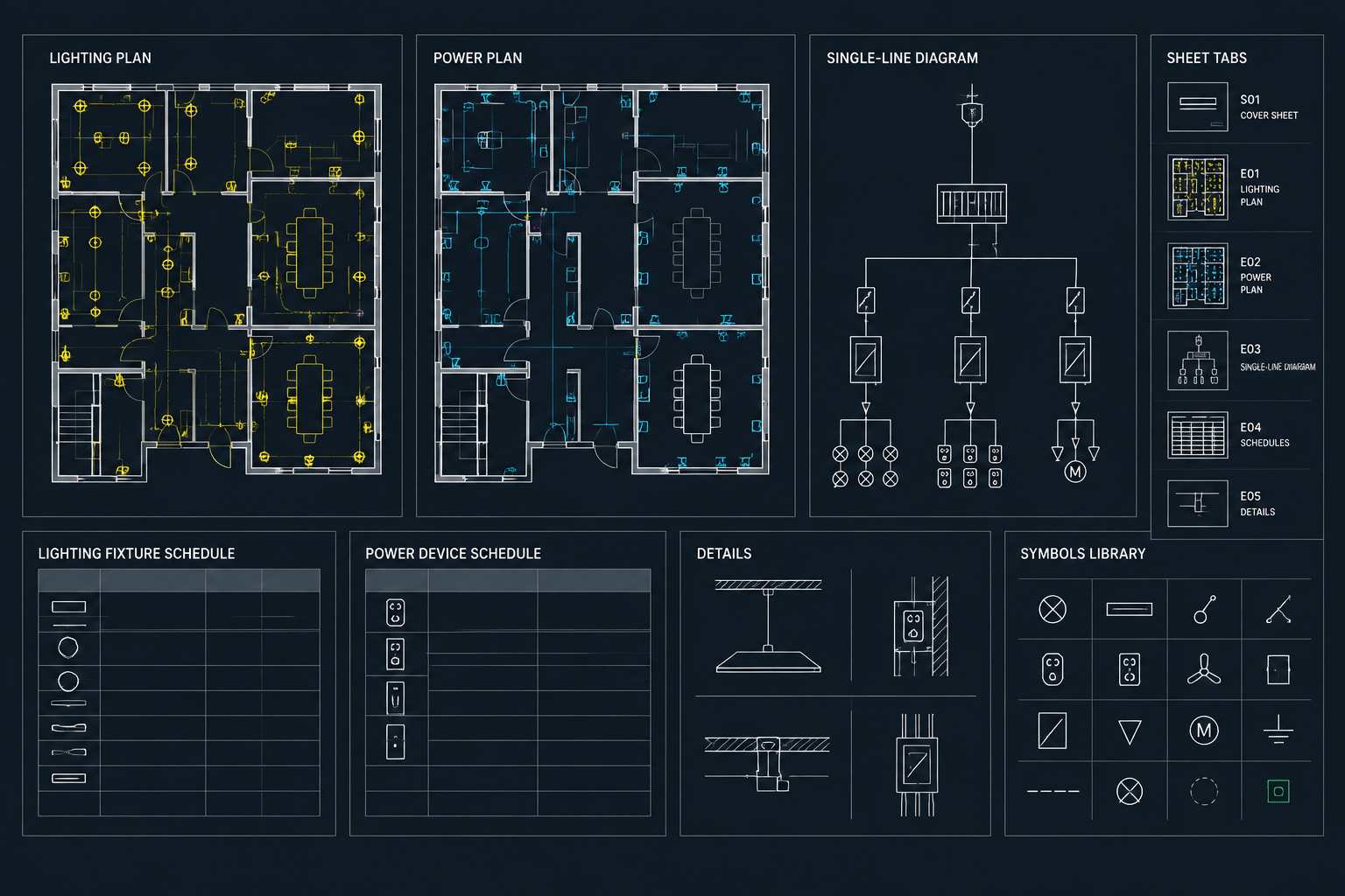
Reviewing only an isolated detail can miss sheet-wide problems. A successful hierarchy should work across the complete issue set, including floor plans, enlarged plans, details, schedules, and single-line diagrams.
Common Plotting Problems and Better Responses
Everything plots too heavily
First determine whether the problem comes from the plot configuration, layer assignments, or fixed object properties. Do not lighten objects individually until the underlying cause is known. Object-by-object corrections create inconsistent files and make future revisions difficult.
The background overwhelms electrical work
Review screening and reference-layer plotting before making electrical symbols excessively heavy. Strengthening every electrical object can create a different readability problem, especially around text and circuiting.
Symbols disappear into walls or furniture
Check symbol placement, background intensity, draw order, and any masking strategy. A controlled mask can improve clarity, but it should not conceal important architectural or electrical information.
Dashed lines plot as continuous
Evaluate the linetype pattern through the sheet viewport and in the final PDF. The pattern may be compressed by scale or may not be supported by the current object and viewport settings.
One imported block plots differently
Inspect the block definition for fixed properties, nested layers, and fills. Normalize the block according to project drafting practices rather than changing the entire plot system to accommodate one symbol.
Build a Repeatable Quality-Control Routine
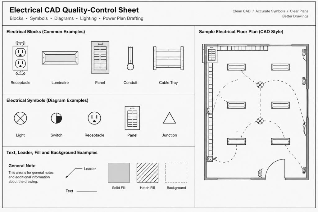
Graphic hierarchy is most reliable when it becomes part of routine CAD quality control. Keep a representative test sheet containing typical electrical symbols, text, leaders, circuit lines, equipment outlines, background references, fills, and status linetypes. Use it to evaluate changes to templates, plot configurations, or block libraries before those changes affect a full project.
A clear electrical drawing should guide the reader naturally from major equipment to devices, connections, and supporting notes. Coordinated lineweights, linetypes, screening, and plot styles make that possible. The result is not only a cleaner sheet, but also a document that is easier to coordinate, review, revise, and use.
Leave a Reply
You must be logged in to post a comment.