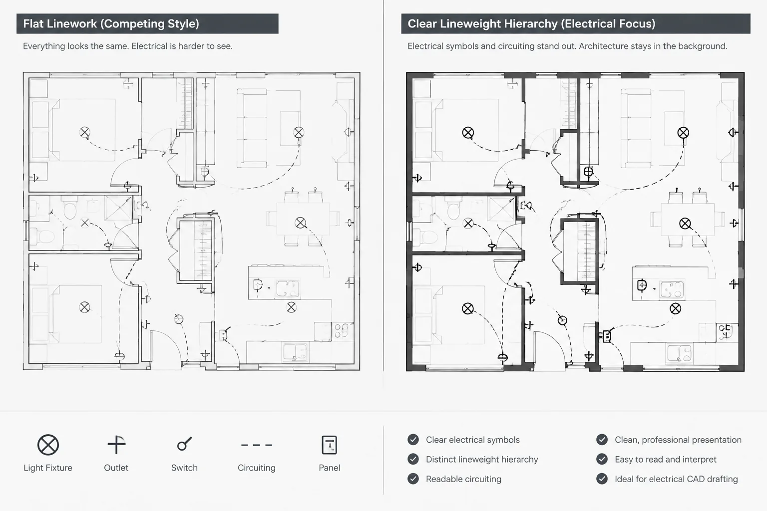
A clear electrical drawing depends on more than accurate geometry and annotation. The plotted sheet must also show readers where to look first, which lines represent electrical scope, and which graphics provide supporting context. An electrical CAD lineweight hierarchy creates that visual order across plans, diagrams, details, and referenced backgrounds.
The guidance below explains how to classify drawing content, coordinate layers and block properties, and evaluate hierarchy through the actual plotting workflow. It is intended as a drafting and documentation reference; project templates, client requirements, and established office standards should govern final output.
An electrical drawing can contain accurate symbols, complete circuit information, and carefully coordinated notes yet still be difficult to use. One common cause is a weak lineweight hierarchy. When every object plots with similar visual strength, architectural walls compete with electrical devices, circuit lines disappear into the background, and minor reference geometry looks as important as the work being documented.
An effective electrical CAD lineweight hierarchy gives each class of information an intentional visual role. Primary electrical scope should be easy to find, supporting information should remain legible, and background geometry should provide context without dominating the sheet. This hierarchy must be evaluated in the plotted output, not only in the CAD editor.
What Lineweight Hierarchy Means
Lineweight hierarchy is the organized use of heavier, medium, lighter, and screened graphics to communicate importance. It does not mean assigning a unique thickness to every layer. A practical hierarchy usually relies on a limited set of visual levels that can be recognized quickly.
The hierarchy may be produced through object lineweights, layer properties, color-dependent plot styles, named plot styles, screening, or a combination of these methods. The specific implementation depends on the project template and delivery requirements. Regardless of the method, the visual objective remains the same: readers should be able to distinguish electrical scope from context and identify the most important information without searching through graphic noise.
Organize Information by Visual Role
Before changing layer colors or plot settings, classify drawing content by its purpose. This is more reliable than making isolated decisions about individual objects.
| Visual role | Typical content | Drafting objective |
|---|---|---|
| Primary electrical scope | Equipment outlines, major devices, distribution components, and prominent diagram elements | Establish the main subject of the drawing |
| Electrical connectivity | Circuiting, feeders, control links, conduit paths, and diagram conductors | Show relationships and routing intent clearly |
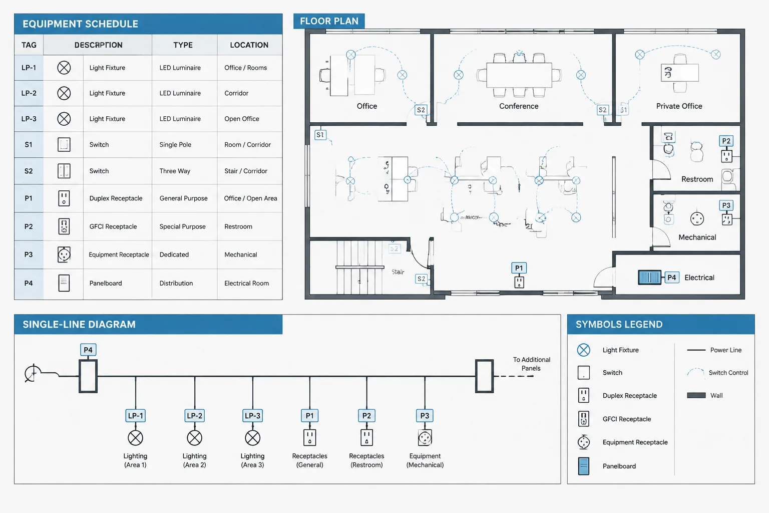
| Electrical annotation | Device tags, circuit identifiers, equipment names, notes, and callouts | Remain readable and visually associated with the correct object |
| Secondary electrical detail | Internal block geometry, mounting references, accessory graphics, and minor boundaries | Support interpretation without competing with primary scope |
| Coordination background | Walls, doors, ceilings, casework, structural elements, and other consultant geometry | Provide location and spatial context |
| Reference or non-plot information | Construction lines, viewport aids, working notes, and temporary review graphics | Support production while remaining controlled at issue time |
This classification can guide layer standards, block construction, plotting, and quality-control reviews. It also helps explain why simply assigning all electrical layers a heavy output is rarely successful. Circuiting, symbols, tags, and equipment outlines do not necessarily need equal emphasis.
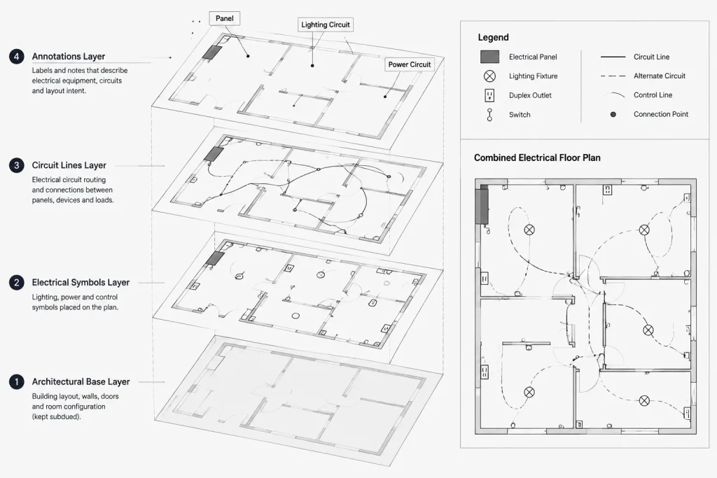
Build the Hierarchy from the Background Forward
Control the architectural background
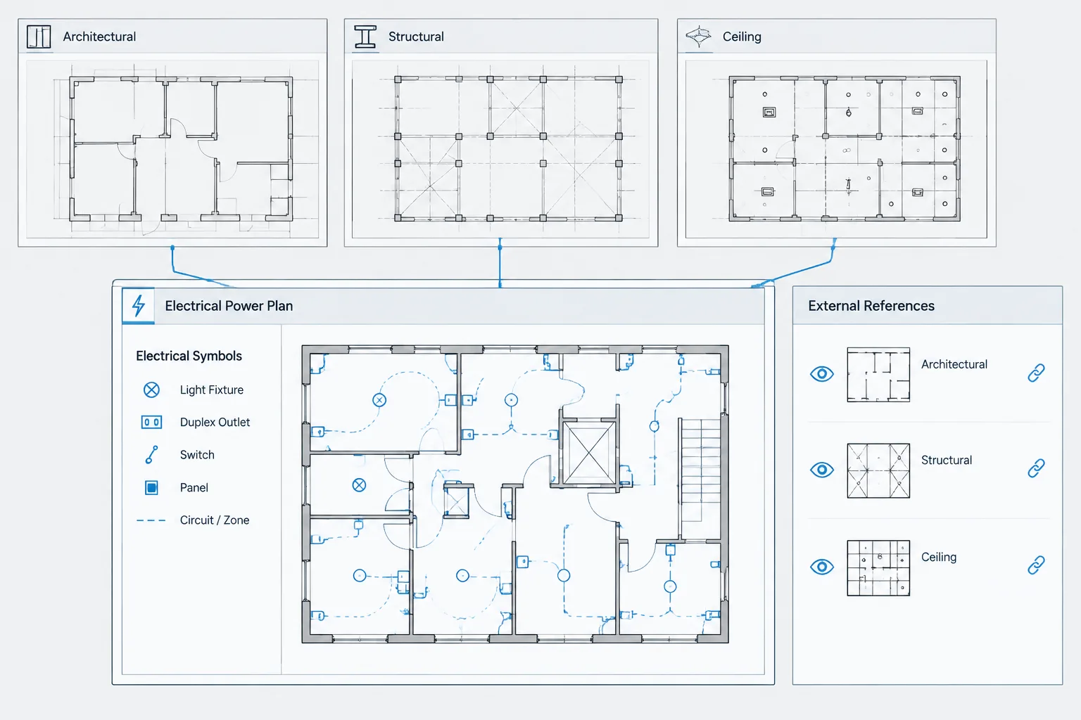
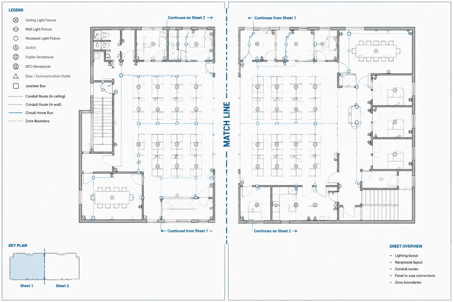
Electrical plans depend on architectural context, but the background should not visually overpower the electrical work. Walls, room boundaries, doors, reflected-ceiling information, furniture, and equipment supplied by other disciplines may need different treatment depending on the plan type.
A screened or lighter background often works well, but screening should be tested carefully. If it is too faint, room geometry and equipment locations become difficult to interpret. If it is too strong, electrical symbols become buried. Dense hatches, poche, overhead elements, and duplicated linework deserve special attention because they can create dark areas even when individual lines are light.
Do not edit a consultant’s source file merely to achieve a preferred plot appearance unless the project workflow specifically calls for it. Layer overrides, mapped layers, controlled reference files, or plot-style treatment can preserve the source while producing a usable electrical sheet.
Establish primary electrical objects
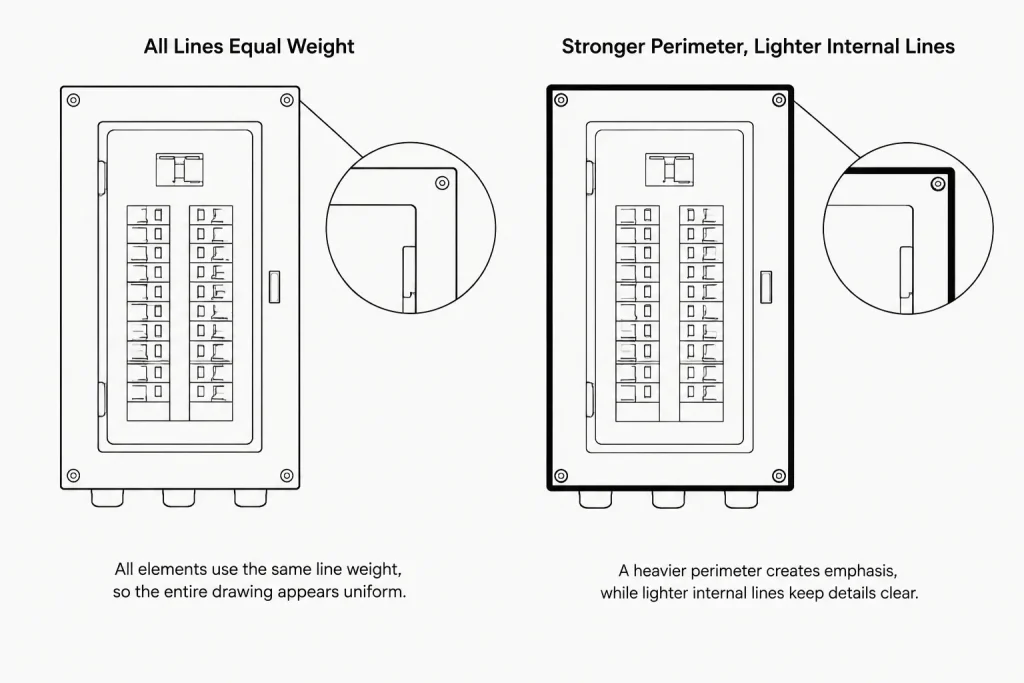
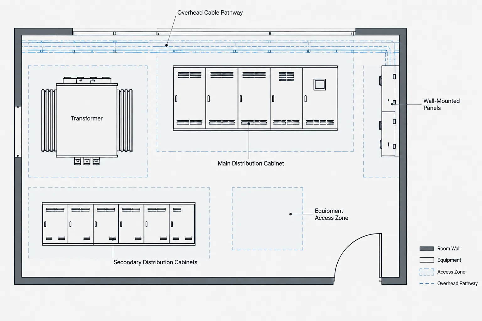
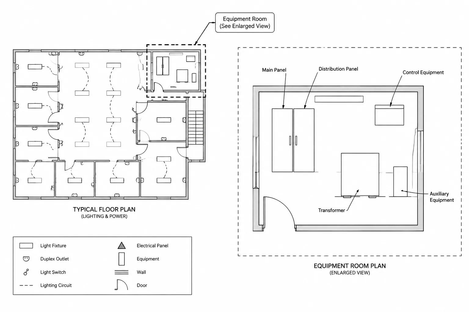
Major electrical objects should form the strongest electrical layer of the plan. Examples may include equipment footprints, panel locations, transformers, switchboards, generators, major junction points, and other items central to the drawing’s purpose. The appropriate emphasis depends on the sheet. A lighting plan may prioritize fixture and control symbols, while a distribution plan may emphasize equipment and feeder relationships.
Heavy outlines should be used selectively. Making every edge within an equipment block equally bold can turn the block into a dark patch. A better block may use a stronger perimeter with lighter internal lines, provided the resulting symbol remains recognizable at the intended plot scale.
Keep connectivity continuous and distinguishable
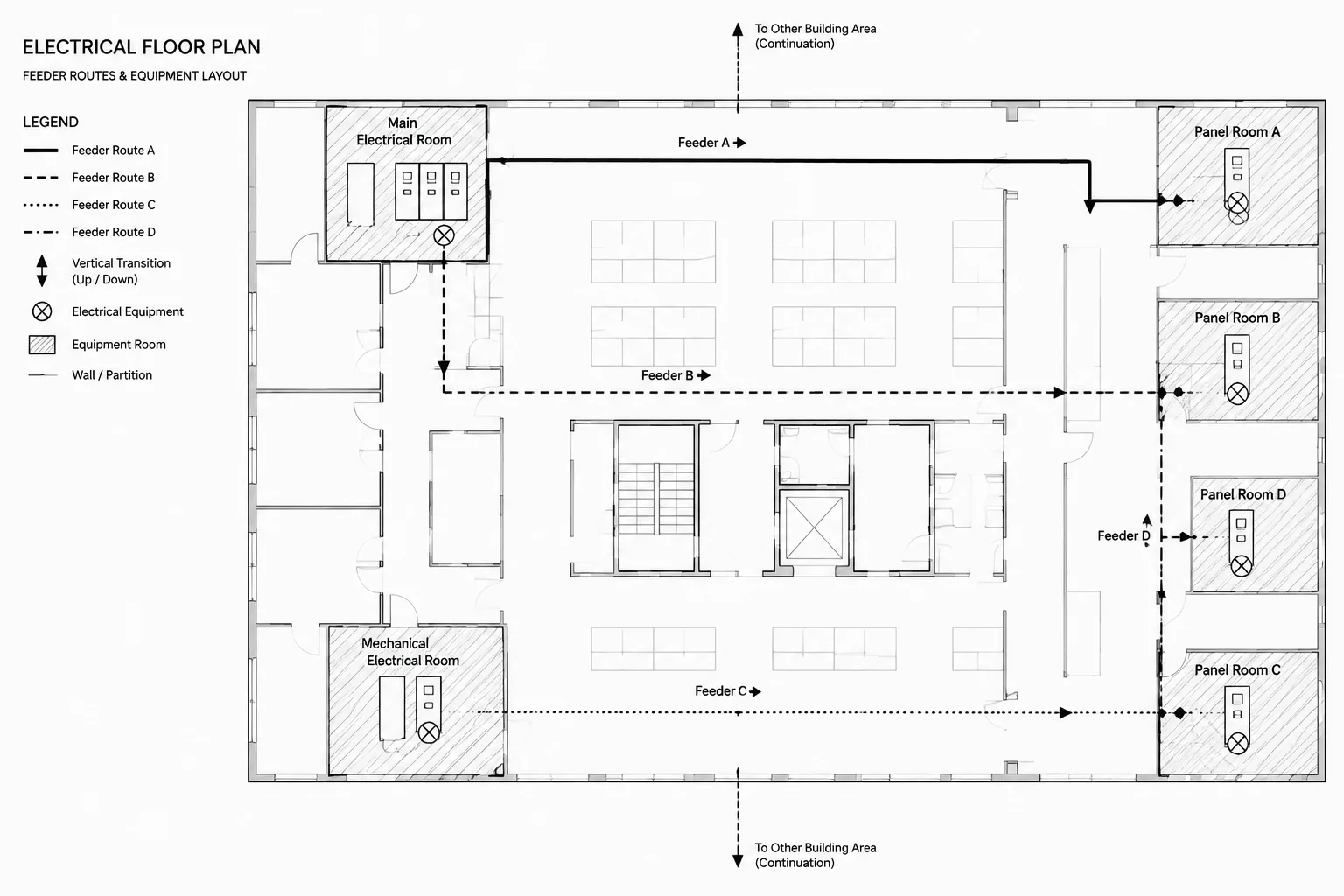
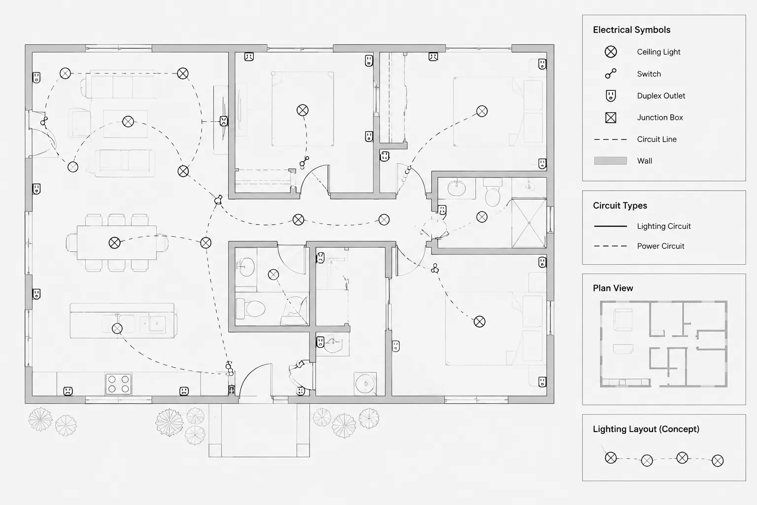
Circuit lines and diagram conductors often cross backgrounds, symbols, room names, and other annotations. Their lineweight must be strong enough to remain continuous but not so strong that they obscure device symbols or text.
Different line types may communicate routing conditions, scope, or system relationships, but line type alone should not carry every distinction. Dashed and patterned lines can lose clarity when plotted too lightly or shown through dense backgrounds. Check both lineweight and pattern readability at the actual sheet scale.
Protect annotation readability
Text, leaders, tags, and callout boundaries need consistent output. Annotation that is too light may disappear after PDF reduction or printing, while annotation that is too bold can close up character shapes and crowd nearby symbols.
Leaders should be visually subordinate to the text and object they connect. Tag boundaries should identify information without becoming the most prominent shape on the plan. When a tag covers important background geometry, a controlled mask may improve readability, but excessive masking can hide coordination conflicts.
Lineweight Considerations for Different Drawing Types
Lighting and power plans
On floor plans, the primary challenge is separating electrical content from a detailed architectural background. Symbols should read clearly at normal viewing size, circuiting should remain traceable, and room information should stay visible enough to establish location. Existing-condition and demolition graphics may also need a separate visual treatment so that status is not communicated only by lineweight.
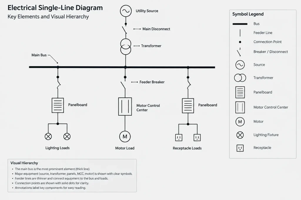
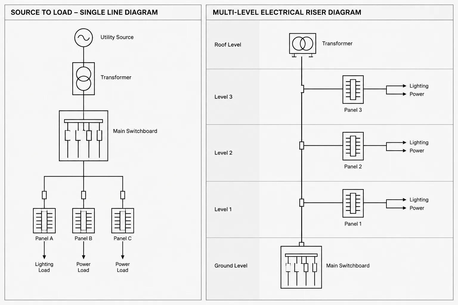
Single-line and riser diagrams
Diagrams typically contain less background geometry, so hierarchy comes from the relationship among buses, feeders, equipment symbols, protective-device graphics, and annotation. A major bus or backbone may warrant more emphasis than branch connections. However, an overly heavy bus can crowd connection points and labels. Consistent spacing and alignment are as important as thickness.
Details, sections, and elevations
Detailed views often use stronger profile lines to define cut or foreground elements, with lighter lines for objects beyond the viewing plane. Electrical components should remain distinct from architectural or structural assemblies. Hatches should support material or area recognition without filling small spaces so densely that electrical notes and leaders become hard to read.
Site and underground plans
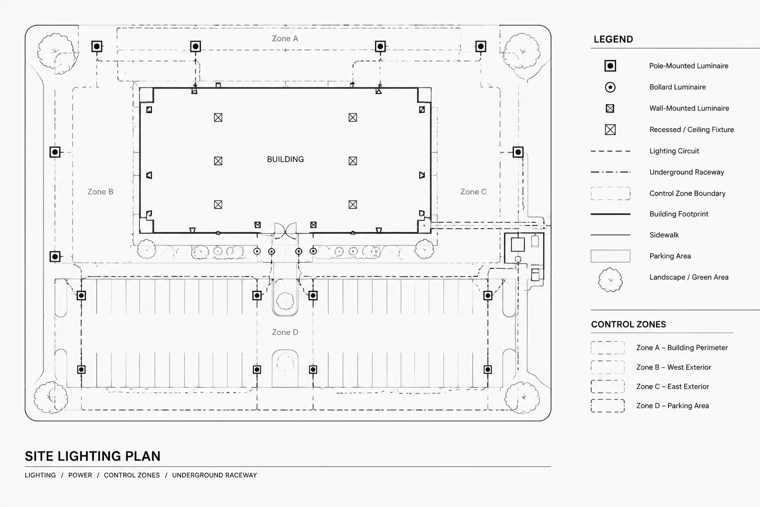
Site backgrounds may include contours, utilities, paving, landscaping, and survey information. These drawings benefit from aggressive background control, but existing features needed for routing decisions must not be faded beyond usability. Proposed electrical pathways, equipment, and connection points should be visually identifiable without implying precision or field conditions that the drawing does not establish.
Coordinate Layers, Blocks, and Plot Styles
Lineweight problems are often caused by a mismatch among layer settings, block properties, and plotting rules. A block may appear correct in one file but plot poorly in another because its internal objects use fixed colors, explicit lineweights, or layers that do not match the receiving template.
- Prefer predictable property inheritance for reusable blocks when the library standard permits it.
- Inspect nested blocks for hidden fixed properties that override host-layer behavior.
- Keep annotation, symbol outlines, and internal symbol detail separable when they require different output treatment.
- Avoid using color as the only indication of status if the final deliverable may be printed in monochrome.
- Document special plot requirements so another drafter can reproduce the intended output.
- Verify external references and viewport overrides before assuming a layer property is incorrect.
Review the Plot, Not Just Model Space
Screen appearance can be misleading. Dark backgrounds, display smoothing, zoom level, monitor settings, and layer colors may make geometry look clear in CAD even when the plotted sheet lacks contrast. A lineweight review should therefore include the same output path used for project issuance.
Review representative areas rather than only open spaces. Useful test locations include a crowded electrical room, a corridor with repeated devices, an area with ceiling hatches, a diagram with many connections, and a detail containing text over background geometry. Examine the full sheet and selected dense areas at normal reading size.
A Practical Lineweight Quality-Control Checklist
- Can the drawing’s primary electrical scope be identified immediately?
- Are symbols distinct from the architectural or civil background?
- Can circuit and feeder paths be followed through congested areas?
- Are equipment outlines clear without becoming solid dark shapes?
- Do internal block details remain visible at the intended scale?
- Are notes, tags, and circuit identifiers readable without excessive boldness?
- Do dashed, hidden, and patterned lines retain recognizable spacing?
- Are hatches and poche subordinate to electrical information?
- Do viewport-specific overrides produce consistent results across sheets?
- Have temporary review layers and non-plot construction objects been checked?
- Does the PDF match the intended paper-space preview?
- Will the hierarchy remain understandable if the sheet is printed in monochrome?
Treat Hierarchy as Part of Drawing Communication
Lineweight is not merely a plotting preference. It is part of the information structure of an electrical drawing. A successful hierarchy directs attention, separates scope from context, and helps users trace relationships without misreading graphic emphasis as a technical requirement.
Develop the hierarchy with the project template, symbol library, layer rules, and output workflow in mind. Then test it on actual sheets containing real coordination density. Any office, client, or project-specific drafting requirements should be verified before issue. The goal is not to make every drawing visually dramatic; it is to make the electrical information easy to find, follow, and review.
Diagnosing Lineweight Problems Efficiently
When a sheet looks unclear, determine whether the problem affects an individual object, a content category, a viewport, or the entire plotted output. This distinction helps prevent broad plot-style changes when the actual cause is a fixed property inside a block or an isolated layer override.
- Individual-object problem: Inspect explicit color, lineweight, transparency, and layer assignments.
- Block problem: Review internal geometry and nested content for properties that do not inherit predictably.
- Viewport problem: Compare viewport overrides, reference visibility, and display settings with another sheet.
- Drawing-wide problem: Check the assigned plot style, output configuration, screening behavior, and monochrome conversion.
- Deliverable problem: Compare the plotted file with the CAD preview to identify export, reduction, or printing effects.
Change one category at a time and review a representative congested area after each adjustment. This makes the result easier to evaluate and reduces the chance of correcting one sheet while weakening another.
Make the Hierarchy Transferable
A successful hierarchy should survive normal drawing exchange and revision workflows. Reusable symbols should not depend on unexplained local overrides, and plotting behavior should not rely on one drafter remembering a special setting. Layer naming, property inheritance, block construction, reference treatment, and plot configuration should work together as a documented system.
For team review, describe graphic roles rather than relying only on color names. Terms such as primary electrical scope, connectivity, annotation, secondary detail, and coordination background remain meaningful when files move between displays, monochrome plots, or different CAD environments. This role-based approach also makes drafting decisions easier to audit when the project template changes.
Frequently Asked Questions
Should every electrical object use a heavy lineweight?
No. Using the same strong output for symbols, circuiting, tags, and internal detail removes useful visual distinction. Emphasis should reflect the information role of each object and the purpose of the sheet.
Why does a block plot differently after it is inserted into another drawing?
The block may contain fixed colors, explicit lineweights, nested layers, or other properties that do not follow the receiving drawing’s standards. The host file may also use a different plot style or viewport override. Inspect both the block definition and the destination drawing before changing geometry.
Can layer color be treated as the lineweight hierarchy?
Layer color can help manage plotting, particularly in a color-dependent workflow, but it is not the hierarchy itself. The hierarchy is the visual result in the deliverable. Screening, object properties, block behavior, line types, and output settings can all affect that result.
How should referenced architectural geometry be handled?
Keep enough context to locate and coordinate electrical work while preventing background geometry from dominating the sheet. Where the workflow permits, use reference controls, mapped layers, viewport overrides, or plot treatment instead of editing the consultant’s source file.
Why are dashed circuit lines difficult to read in the final PDF?
The line may be too light, its pattern may be compressed by the drawing scale, or dense background geometry may interrupt its appearance. Review lineweight and pattern behavior together using the same plotting path intended for issue.
When is a lineweight hierarchy ready for issue?
It is ready only after representative dense and open areas have been reviewed in the actual deliverable format. Primary scope, connectivity, annotation, and background context should remain distinguishable without depending solely on screen color.

Leave a Reply
You must be logged in to post a comment.